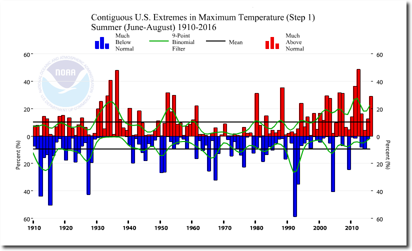
NOAA’s Complete Fake Climate Extremes Index
The EPA has this graph on their website, showing that the worst US heat waves (by far) occurred during the 1930s.

But in classic Orwellian doublespeak, the EPA has another graph claiming the US experiences more unusually hot summer temperatures (the definition of heat waves) than in the 1930s.
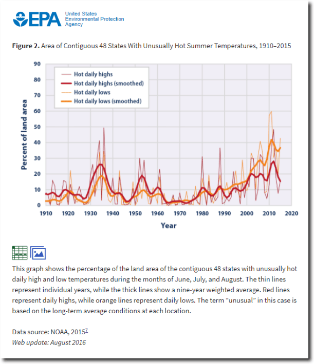
The two claims are mutually exclusive and trace back to NOAA’s Climate Extremes Index (CEI) which shows that summer maximum temperatures in 2012 were hotter than in 1936.
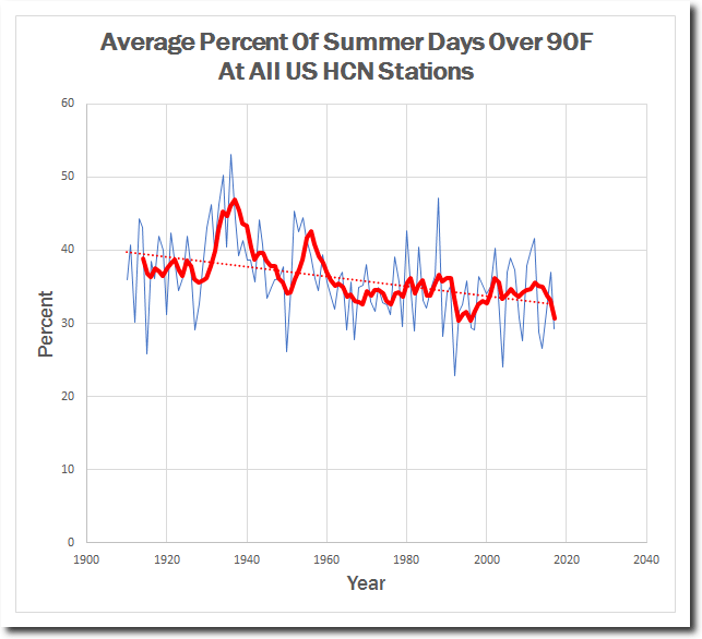
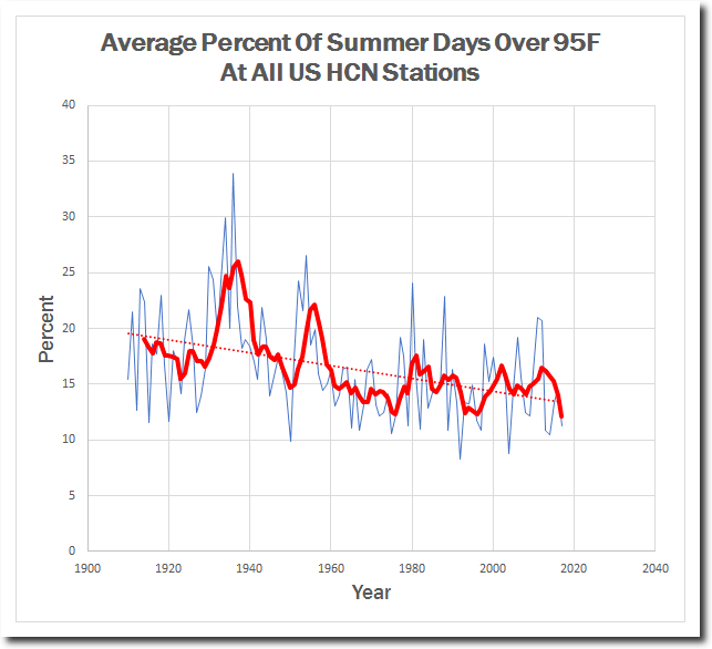
If you have been following my blog, you know that this claim is 100% fraudulent. The 1930’s were much hotter than recent years, and the frequency of heatwaves has plummeted. Below I have compiled all possible tests of this metric, and every single one of them shows that the 1930’s were much hotter than any recent years – agreeing with the first EPA graph.
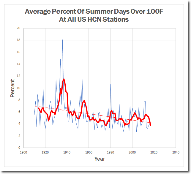
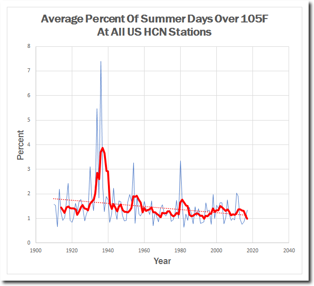
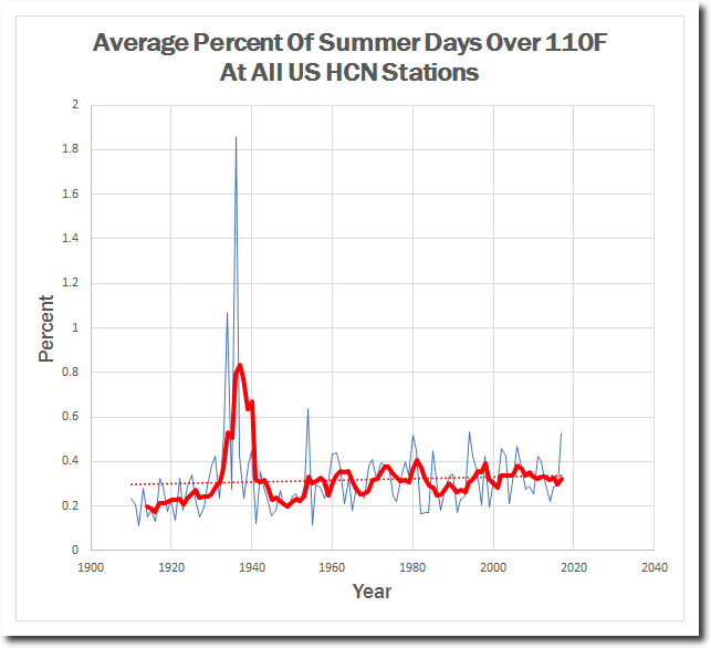
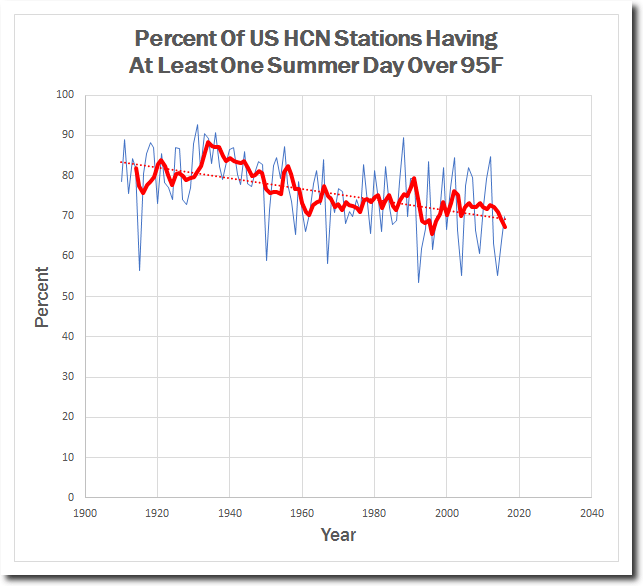
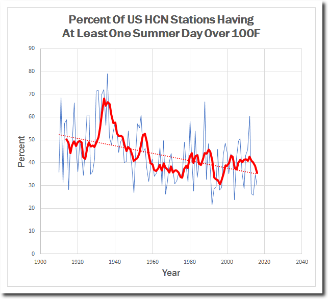
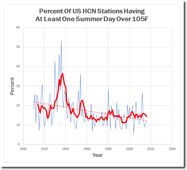
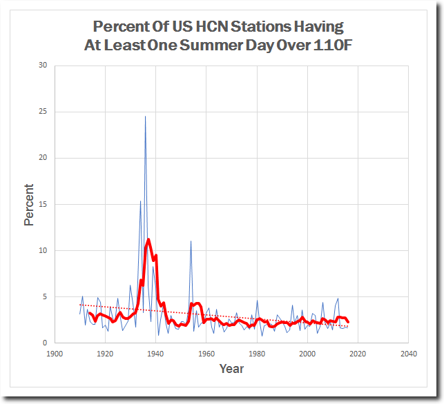
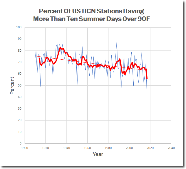
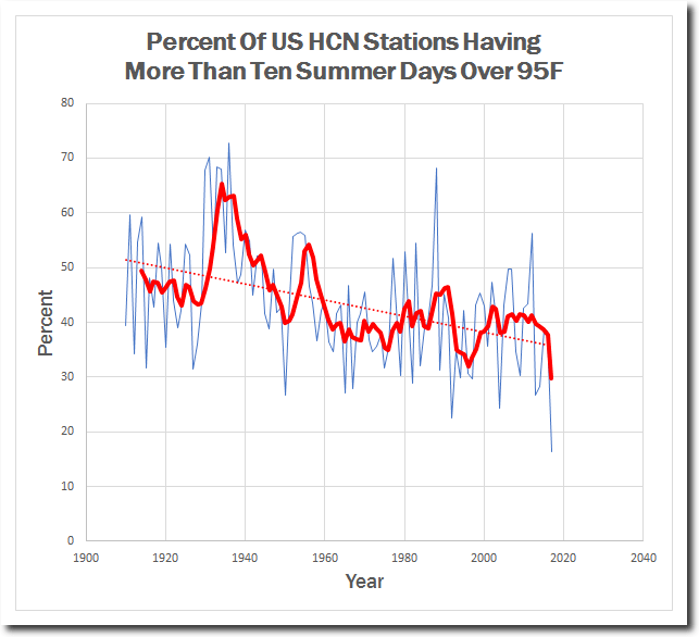
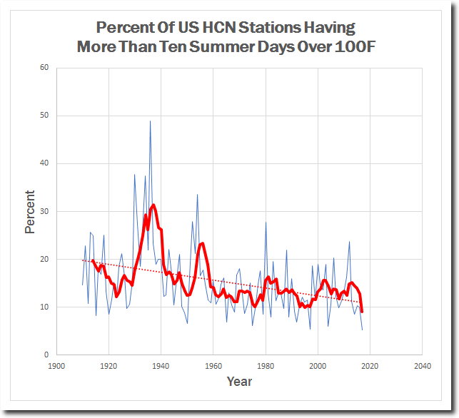
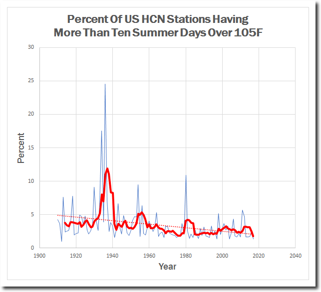
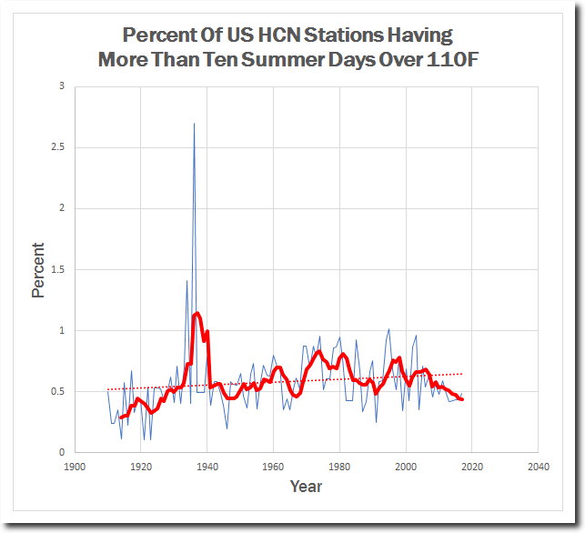
Heatwaves in the 1930’s were more intense, more widespread, and of longer duration. The NOAA Climate Extremes Index is completely fraudulent and forms the basis of the George W. Bush Administration’s wildly fraudulent Climate Assessment.
The most likely explanation for this fake data is that they use tampered USHCN data which cools the past.

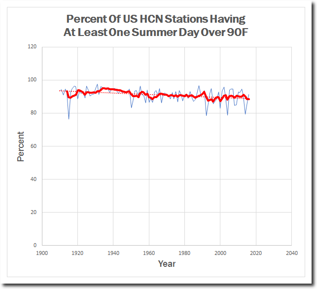
The smoking gun is that a number of the graphs I posted should not have been affected by any of the USHCN adjustments, like the one below.
This is just one more example of straight up climate fraud by the US government.
Read more at Real Climate Science
Trackback from your site.